A London tech firm with enterprise capability and nothing to show for it. We built their entire document system from scratch — seven pieces, one visual language.
Client
TELTC Ltd
Industry
Software · IT · Tech
Services
Document Design · Brand Collateral · Print
Year
2026
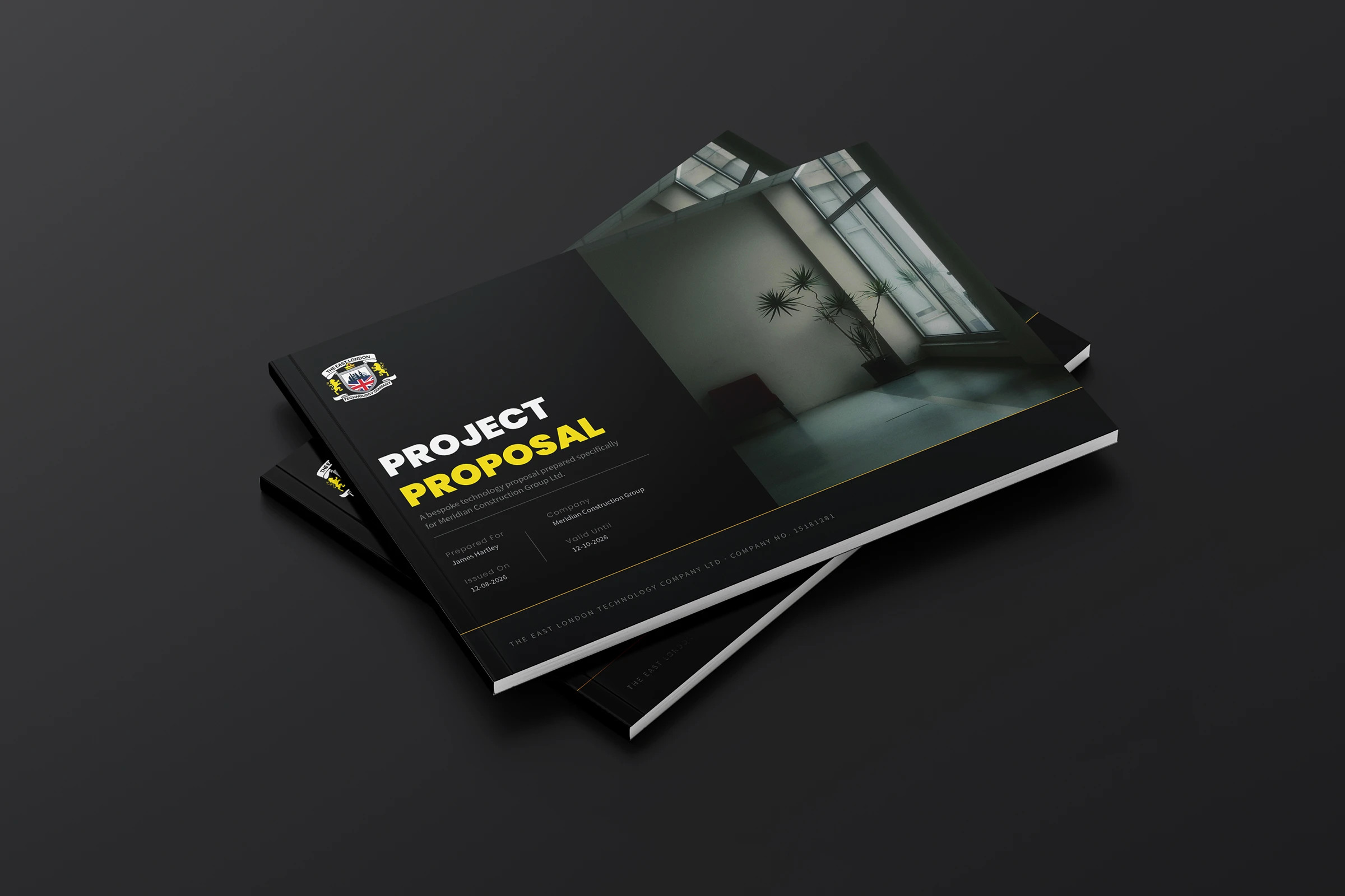
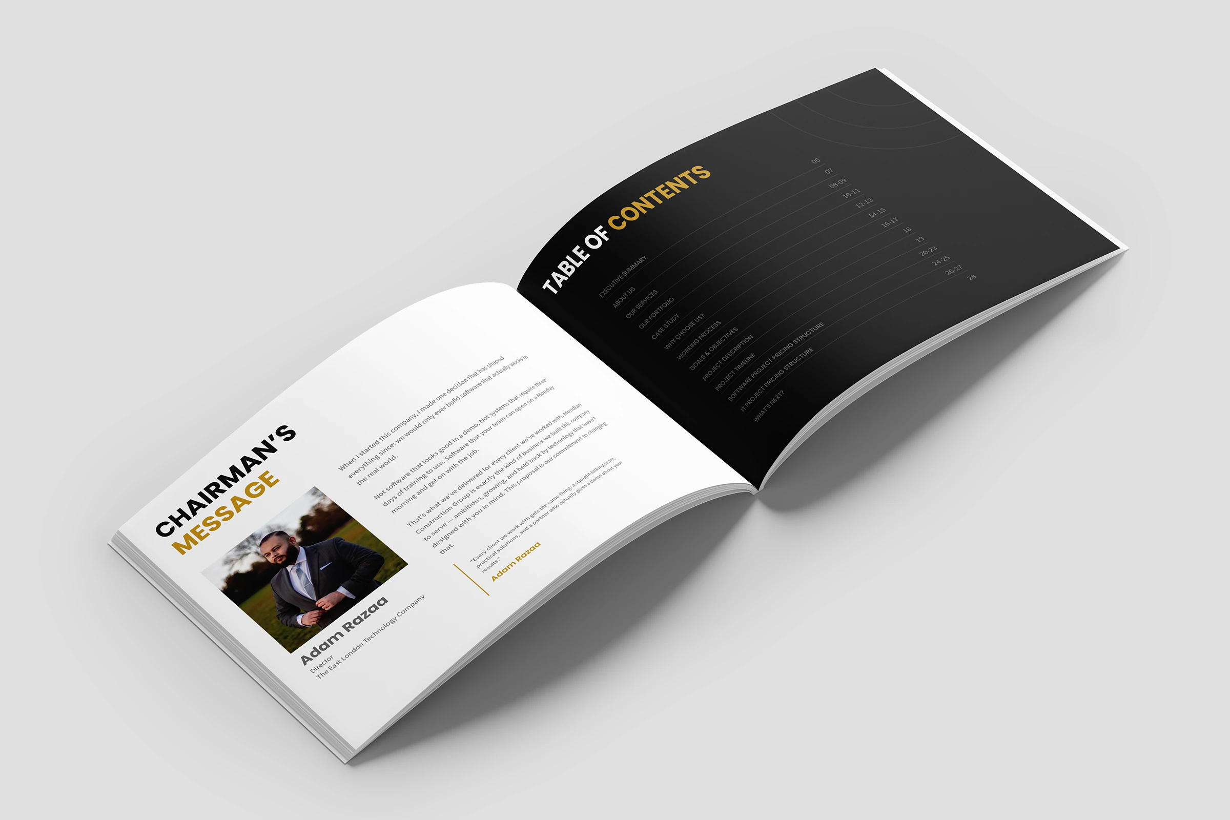
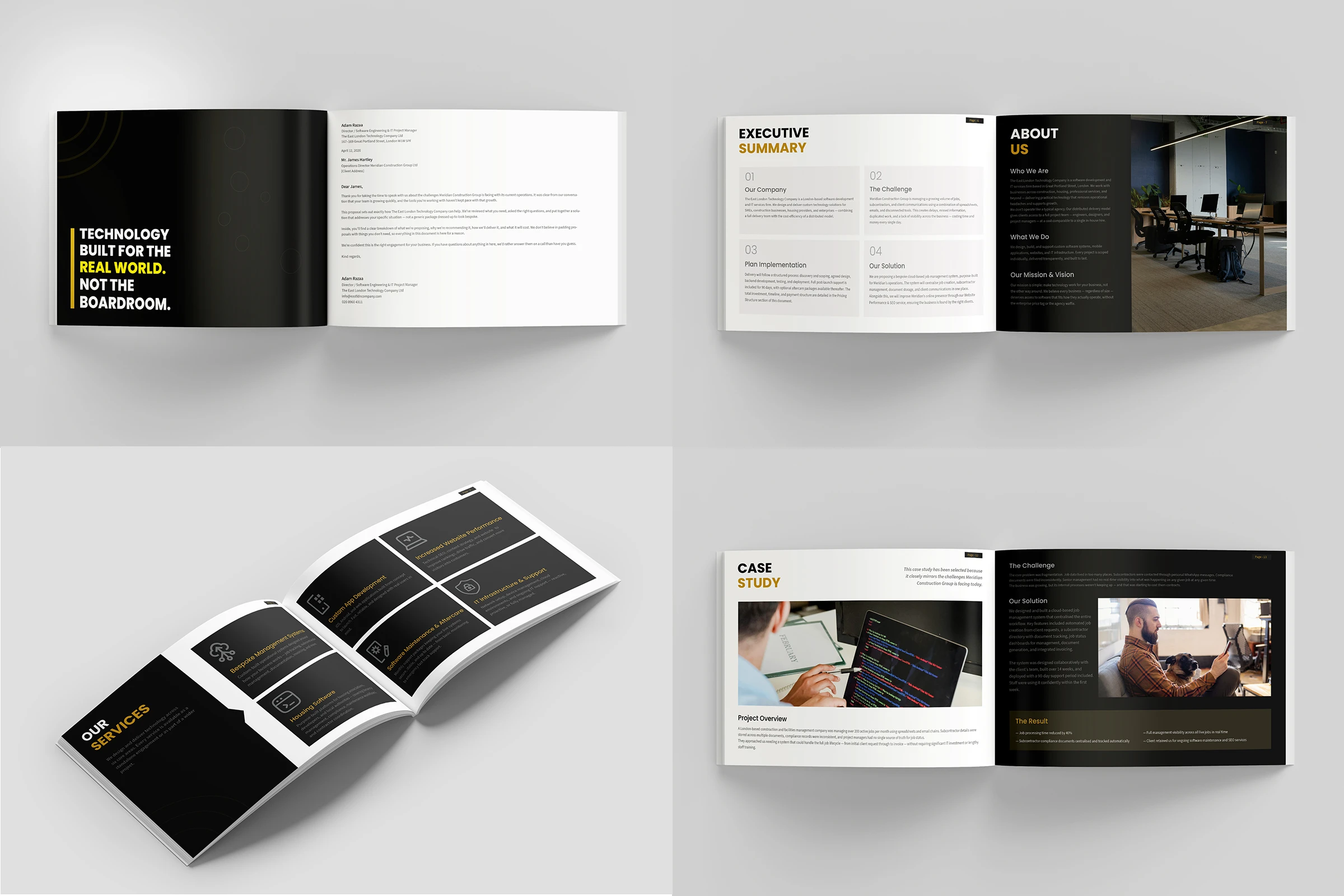
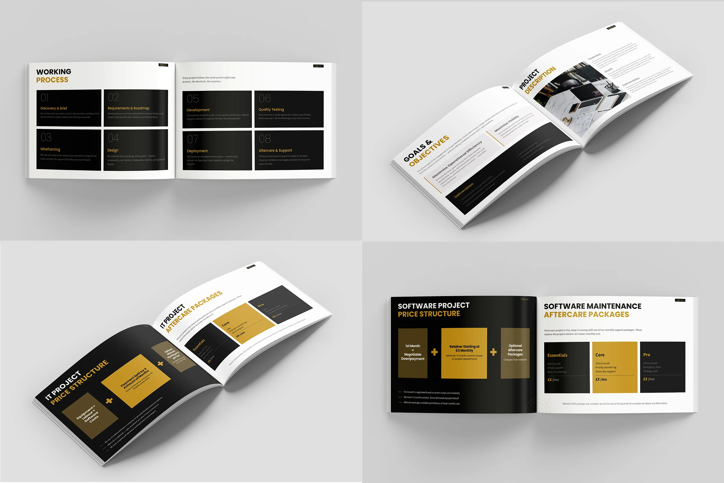
Project Proposal
28 pages. 15 sections. Built to work for any client.
Dark cover panels alternate with clean white text pages — the rhythm stops a long document from feeling heavy. The cover uses full-bleed compressed type. No icons, no illustrations. Just typography doing the work.
THE STRATEGY
Look the part. Win the room.
TELTC does serious work for serious clients — construction firms, housing providers, growing enterprises. But every document they sent looked like everyone else's.
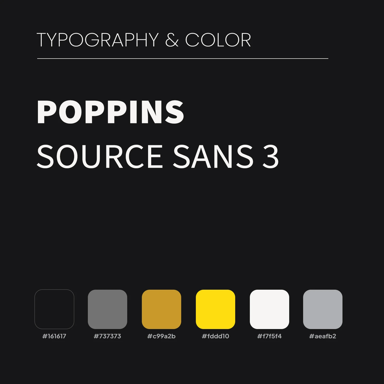
The strategy was to build a suite that commands respect before anyone reads a single word. Dark backgrounds. Gold type. Condensed headlines. In a world of white PDFs and Word templates, that combination signals one thing — this company knows exactly who they are.
THE SOLUTION
Seven pieces. One voice.
Build a suite that commands respect before anyone reads a single word. Dark backgrounds. Gold type. Condensed headlines. In a world of white PDFs and Word templates, that combination signals one thing — this company knows exactly who they are.
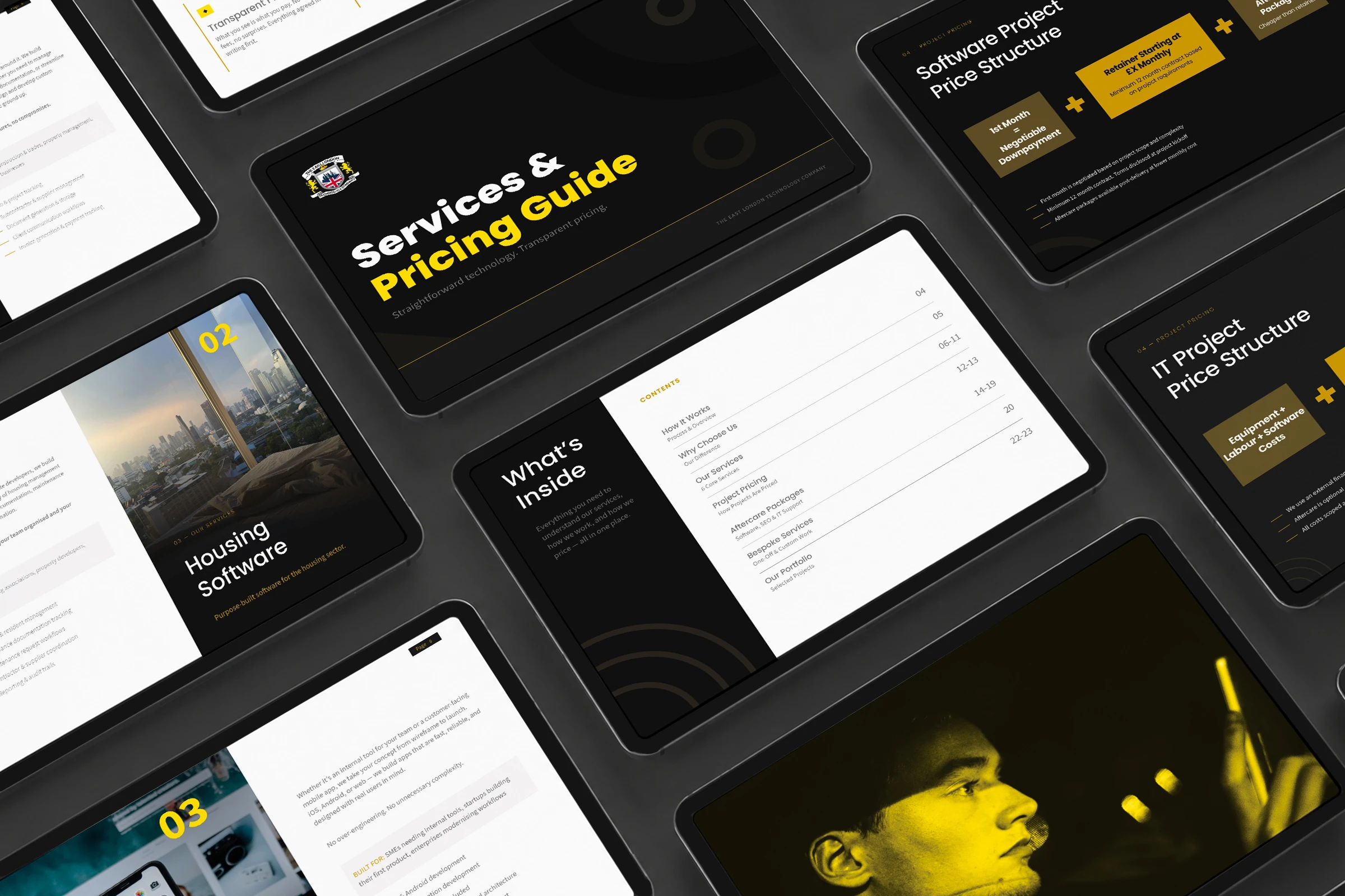
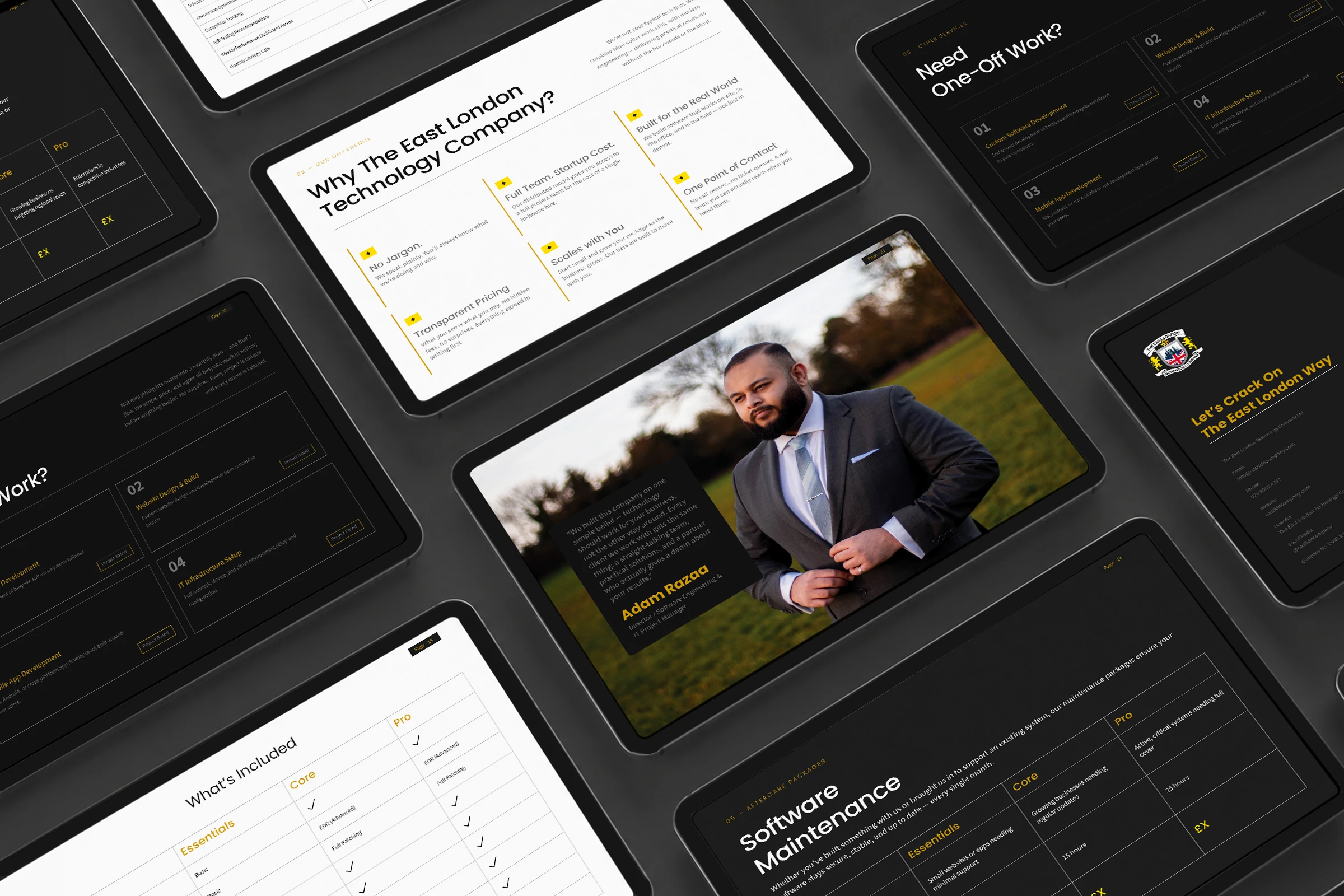
Services & Pricing Guide
Four service categories. Multiple tiers each. A lot of information that could easily lose people.
The solution: each service gets its own spread. Feature image on the left. Tier table on the right. Gold headers act as a reading guide — your eye always knows where to go.
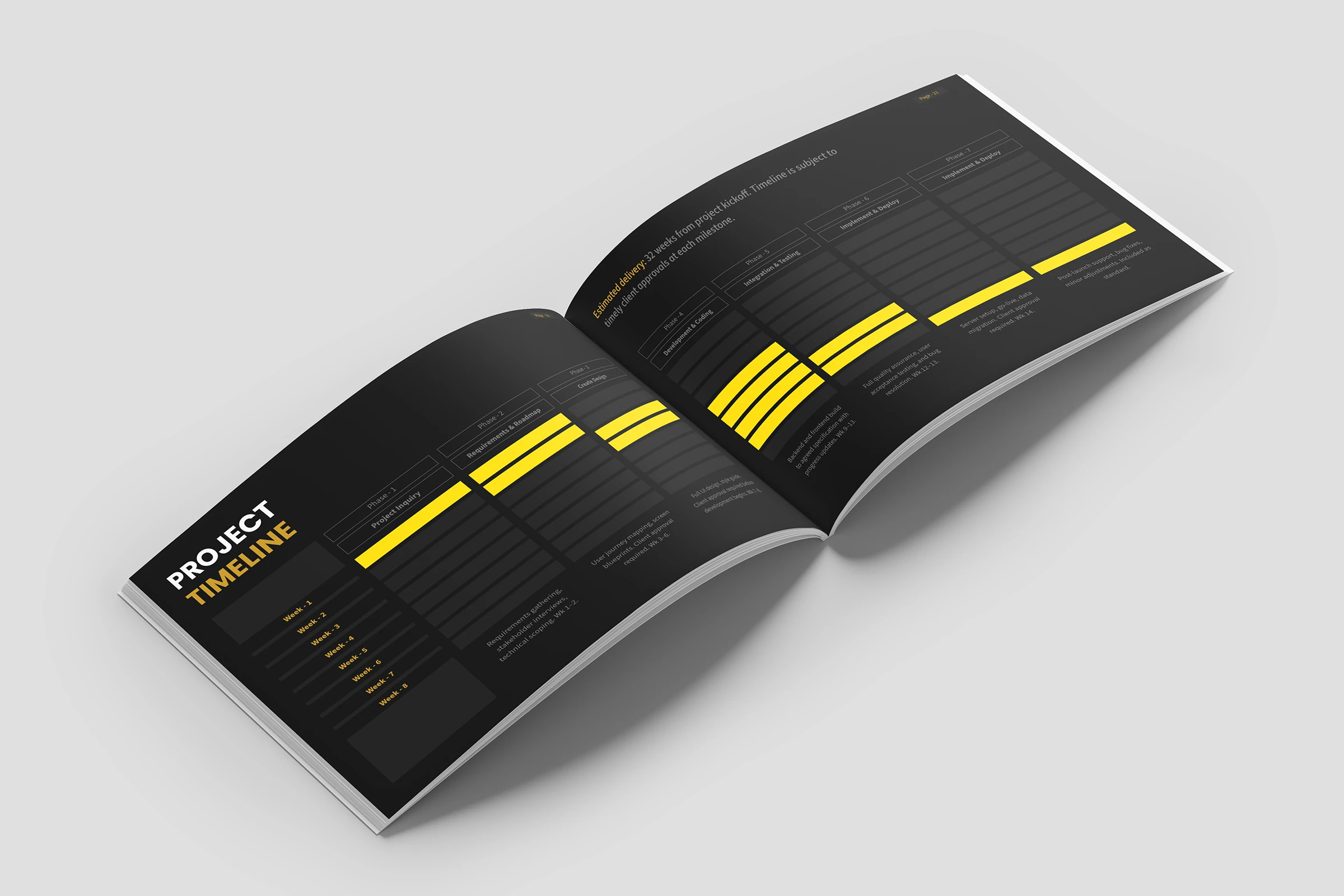
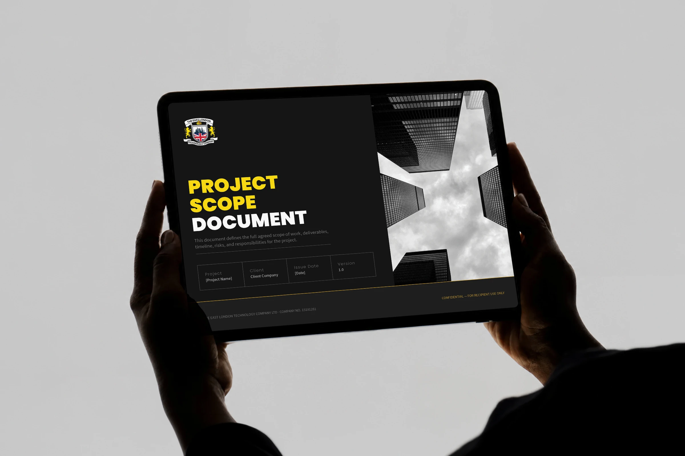
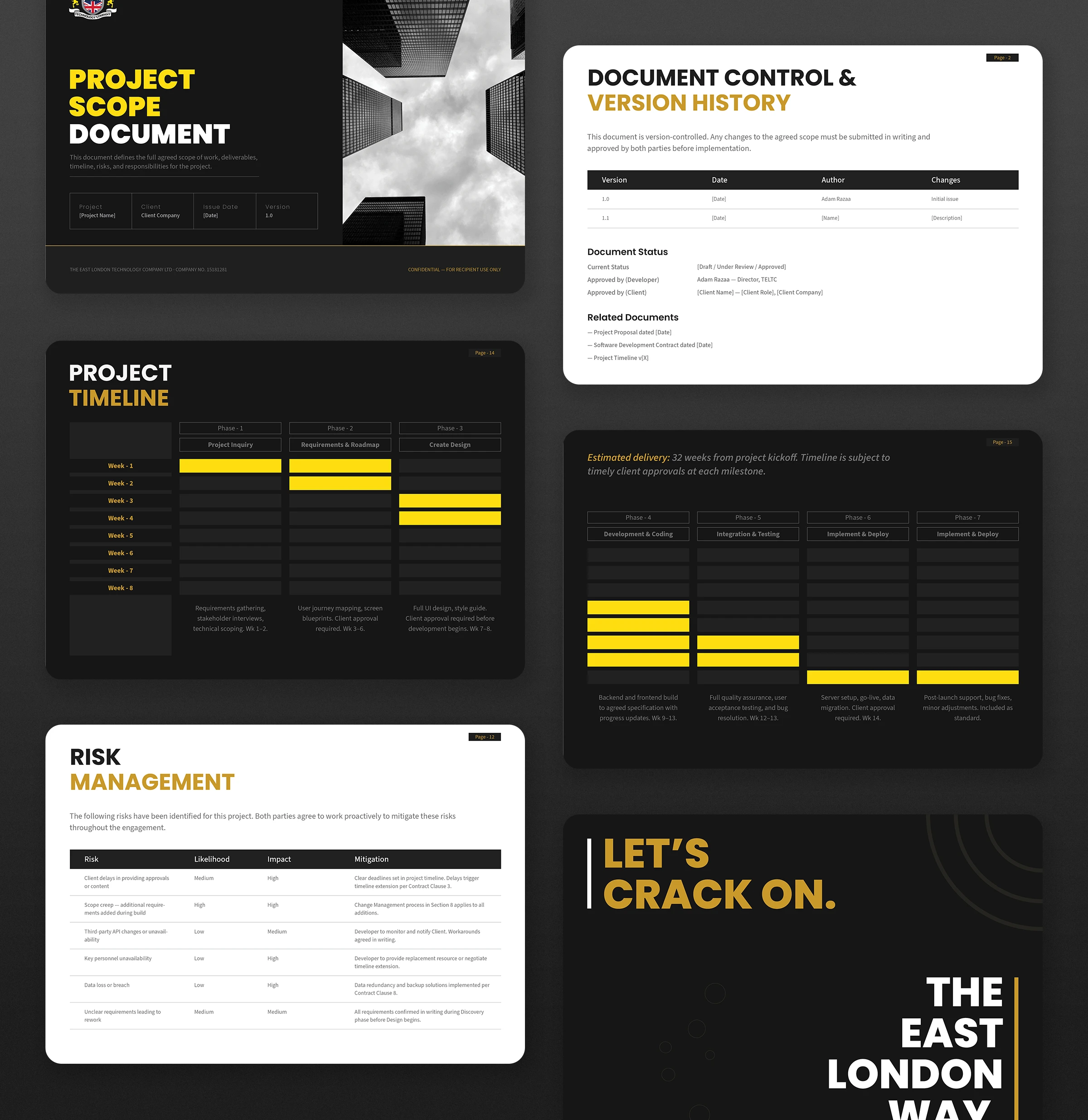
Project Scope
A risk table, a change management form, and a 16-week Gantt-style timeline — all the complexity a growing tech firm needs to run a clean project. Numbered clause badges and a metadata strip at the top so a client always knows exactly what version they're looking at.
Closes the same way every document does: "Let's Crack On. The East London Way."
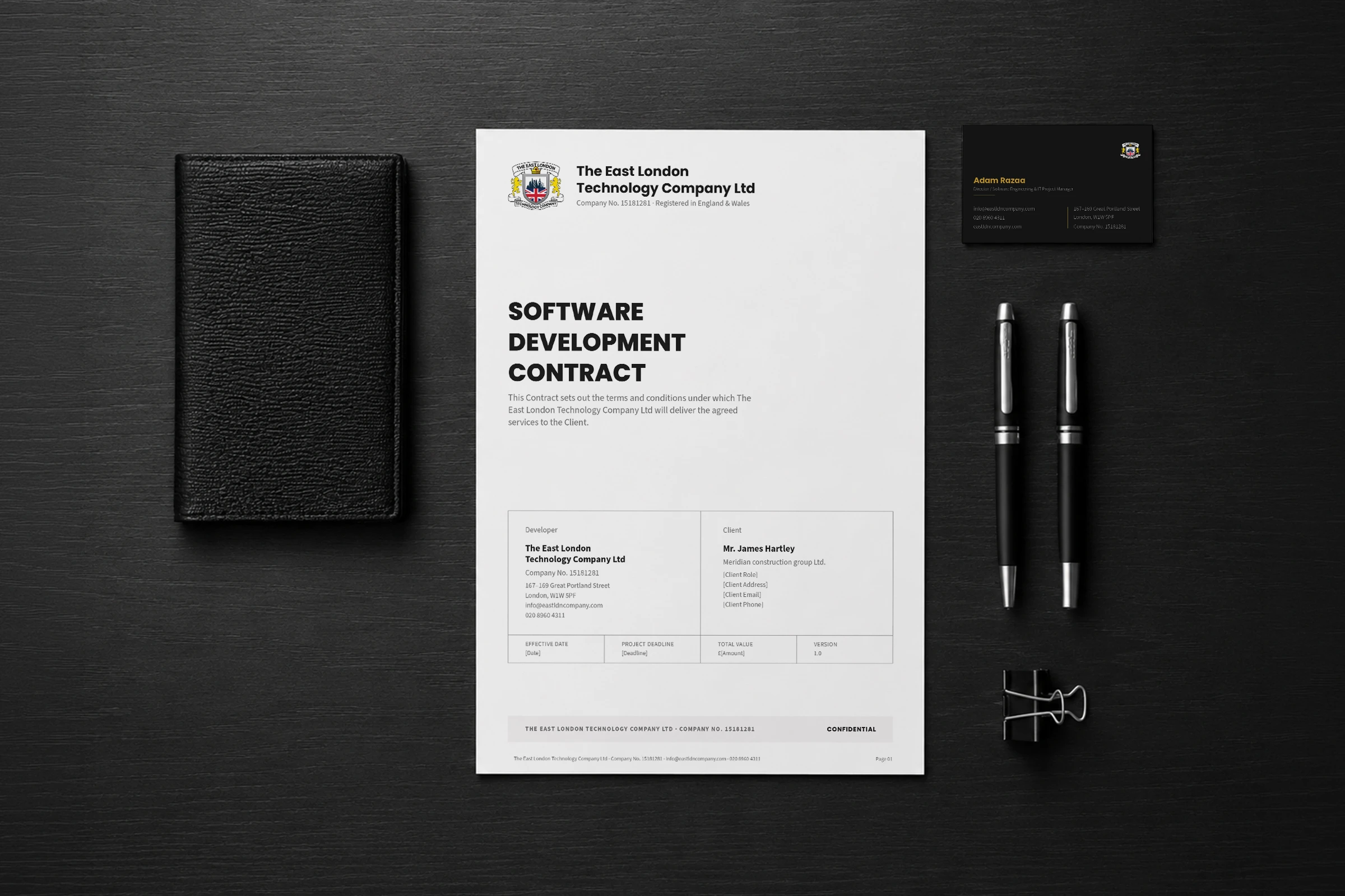
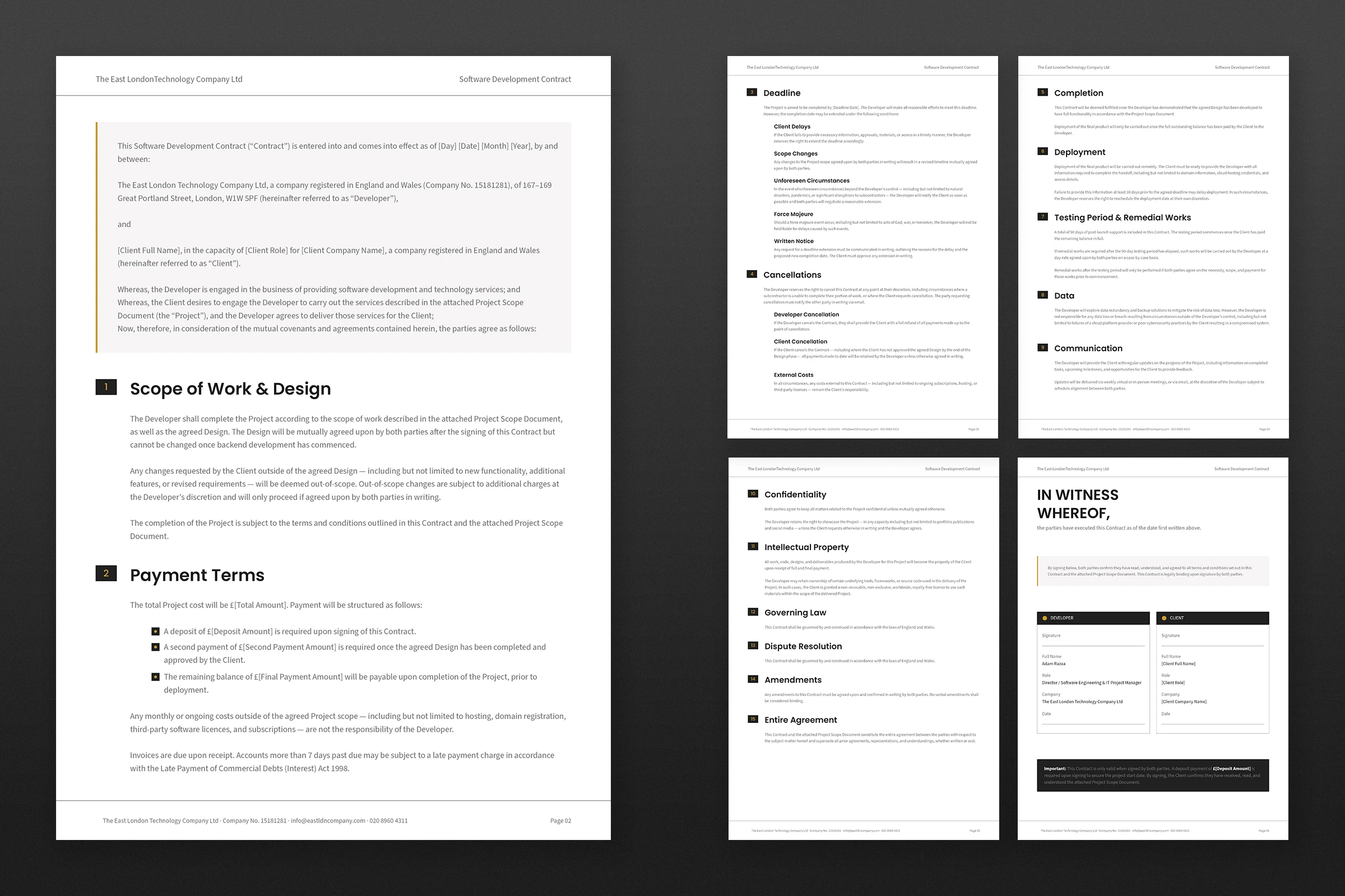
Contract
Clean A4 portrait. Numbered clause badges. Metadata strip at the top showing date, deadline, value, and version — everything a client needs to trust what they're signing.
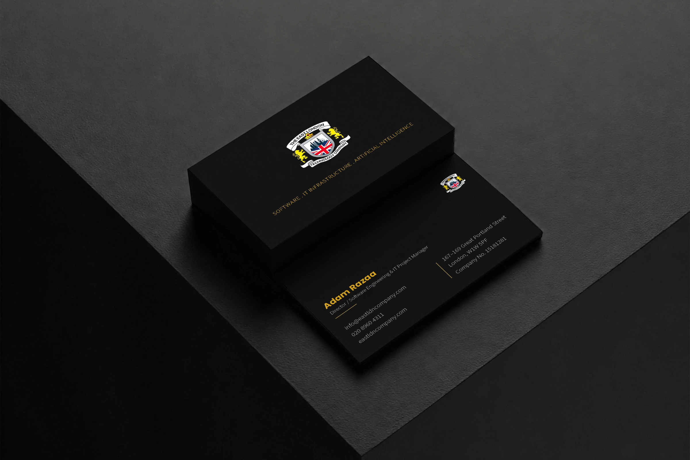
Business Card
Front: the crest, alone, on black. Nothing else.
Back: name, title, contact — split into two clean columns by a single rule.
Most cards try to say too much. This one says one thing per side.
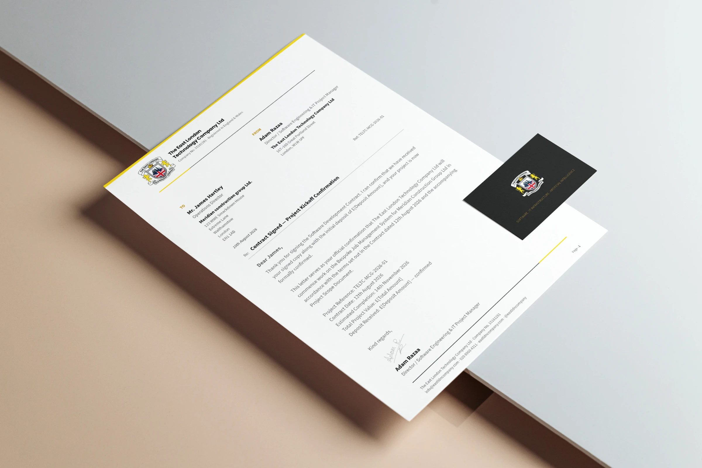
Letterhead
The quietest piece. The most used.
Crest and name in the header. Gold rule. Company details in the footer. A continuation sheet included — same header, blank body. Small detail. Shows you've thought about how a document actually gets used.
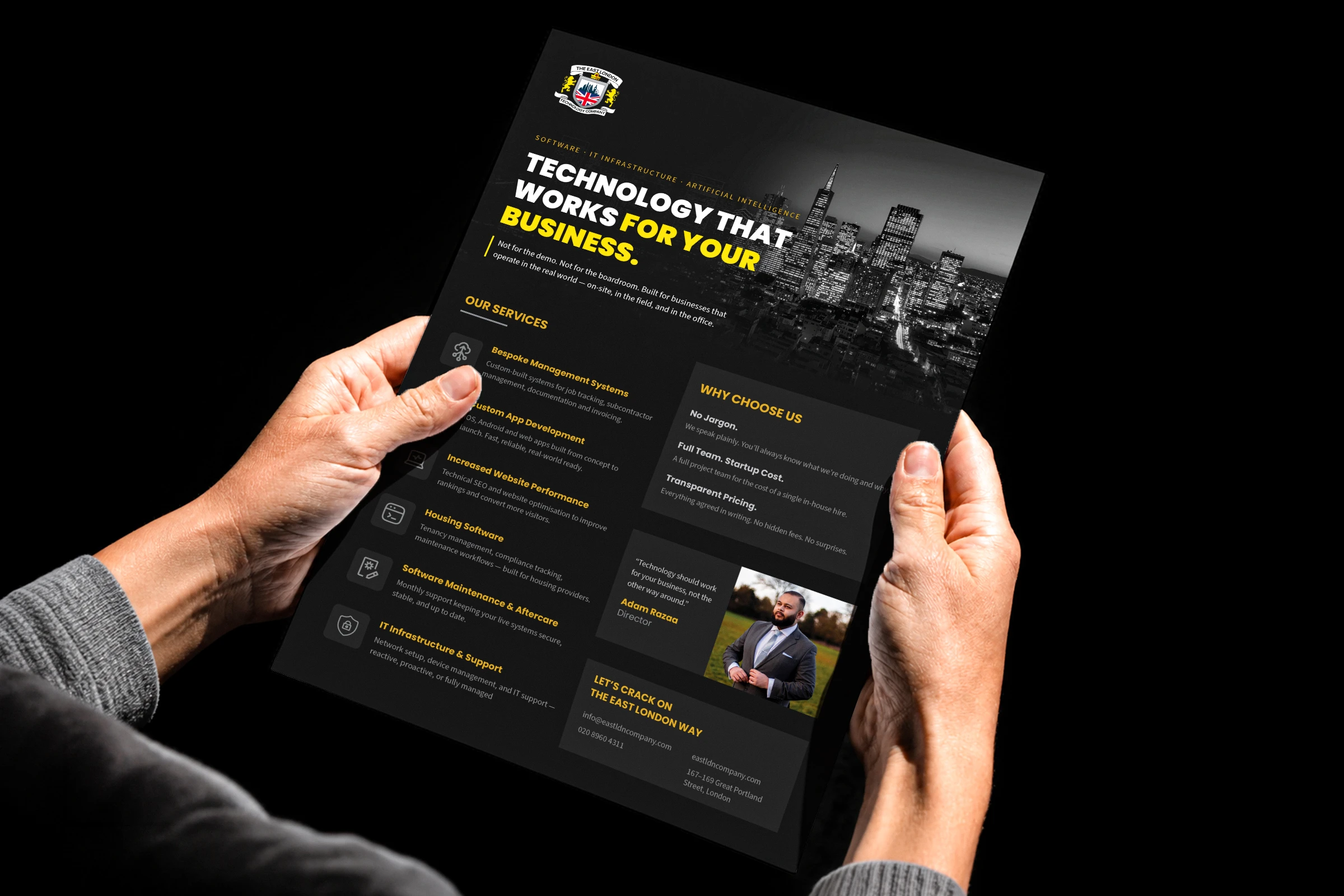
Poster & Leaflet
Works at A3, A4, and A5. Designed to be read in under 30 seconds.
Headline: Technology That Works For Your Business. Not a tagline about tech — a promise about results. Services on the left, three key differentiators on the right, director's photo and quote at the bottom. Human, not corporate.
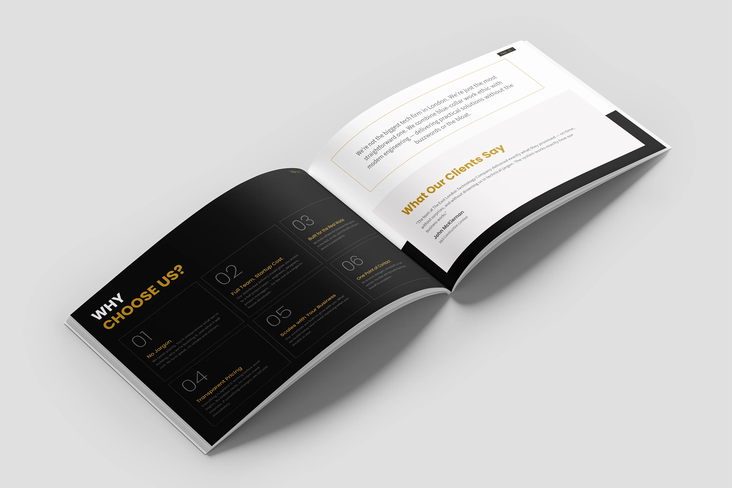
THE RESULT
Before: enterprise capability, generic documents.
After: every touchpoint tells the same story.
One visual language from the first business card to the final signed contract. The dark-gold palette makes TELTC recognisable in any inbox. The proposal turns around in hours, not days. The contract meets what large clients expect before they'll sign anything.
Seven documents. One company. Built to win rooms.
One System
Documents delivered as one system
Zero
Pre-existing brand guidelines
01
Visual identity built from scratch
What the client said.
"Nailed the brief from day one. The work was strong enough that we're already planning what's next."
Adam Razaa, Director, The East London Technology Company